Typography
The VIC typeface family is the standard set of fonts used by Brand Victoria. The use of the VIC font depends on where a brand is positioned on the brand architecture scale (discussed in Brand Architecture). As a general rule, the closer a sub brand is aligned to the Masterbrand, the more likely VIC font will be used.
Download the VIC font (.ttf, .eof, .woff, Zip file, Google Drive, 1.2MB).
There are a range of weights within the VIC family, each of which serve a different purpose. These are explained below.
VIC Bold
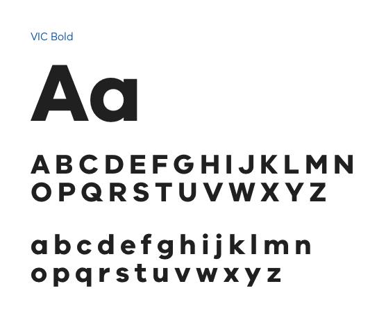
When to use it:
VIC Bold can be used for ALL headings. Choose between Bold or SemiBold.
VIC SemiBold
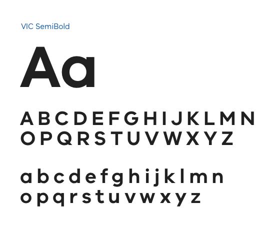
When to use it:
VIC SemiBold can be used for ALL headings. Choose between Bold or SemiBold.
VIC Regular

When to use it:
VIC Regular is used for all body copy, long-form paragraph content, small copy (such as terms and conditions text), and quotes.
VIC Italic
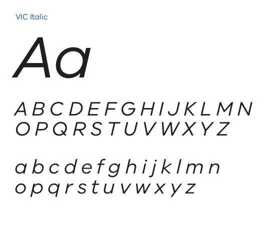
When to use it:
VIC Italic may be used sparingly to emphasise words (such as Acts) or small sections of text. An example of where VIC Italic could be used is a blockquote. In this instance, both the blockquote and the attribution may be italic, or just the blockquote itself. As a note, it is important to only use italics where necessary, and for small blocks of text, to ensure legibility.
VIC Light
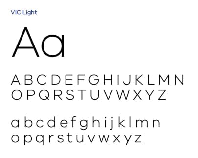
When to use it:
VIC Light may be used for intro copy, where appropriate. For example, on standard content pages with a page header that includes a title and large subtitle, VIC light may be used for the large subtitle. VIC Light should never be used for regular body copy.
When VIC Light is used, the font size should be carefully considered. Since the weight of this font is light, a larger font size is recommended to ensure legibility. This should not be a problem, given the large subtitle rules discussed later on. For example, if the page title is a H2 (VIC Bold, 60px), the large subtitle should be approximately half the size (VIC Light, 30px).
Limiting the amount of copy used in the large subtitle is also important to ensure it does not overshadow the page title. Between one and three lines is ideal.
Arial Typeface Family
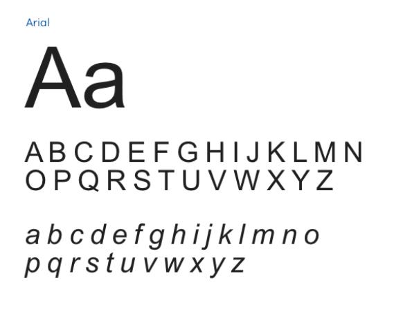
When to use it:
Please note: Arial should not be used in digital designs. This section is directed at developers when selecting fallback fonts. In the event a user cannot display the Brand Vic typefaces on their device, Arial should be used as the fallback font. The same rules established for VIC should be followed when it comes to using various weights within the Arial typeface family.
For example:
- Arial bold for headings
- Arial regular for body copy
- Arial light for large subtitles
- Arial italic for blockquotes
Why we use it:
Arial is the best possible option for a fallback font. This typeface is installed on every device, which means no matter what happens, the designs will remain consistent across all devices. By selecting Arial as the fallback font, we’re ensuring there are no surprises and we’ll always know what our designs look like.
Font sizes change based on browser size, device and other criteria. To find out more about how this works please refer to the section on responsive typography in the Responsive design topic.
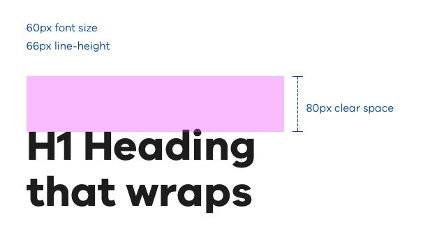
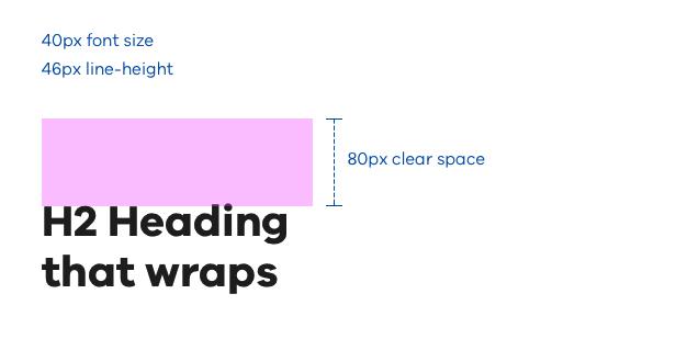
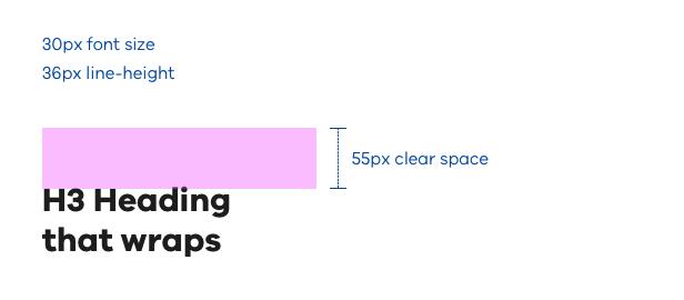
All headings on the web use VIC Bold as their font. Font size, line-height and clear space listed here should always be followed. All sizes listed are for Desktop browsers at 100% size. Fonts are scaled up or down based on device and browser size and resolution.
Five levels of headings have been outlined, but all five should only be used if necessary (for example, edge cases). In most instances, three to four levels of headings will work, which is ideal.
H1
H2
H3
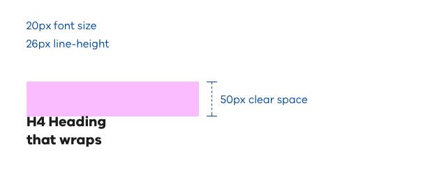
H4
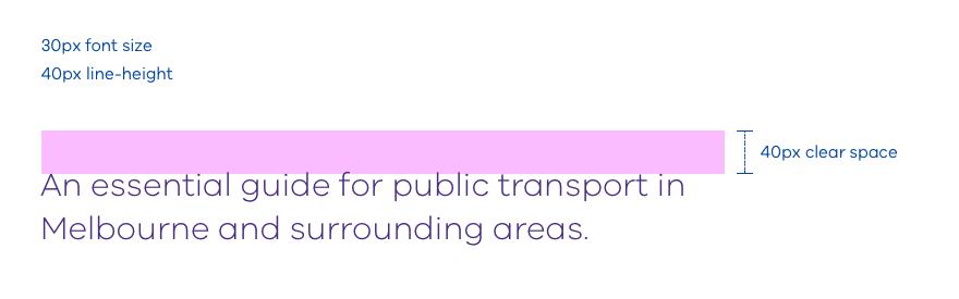
Large subtitle
A large subtitle is typically used directly beneath the largest heading on a page (either a H1 or H2). The content of a large subtitle should be concise and act as an elaboration of the H1 or H2 content. VIC Light is the recommended weight. A maximum length of one paragraph is recommended, or three lines.
Small subtitle
A small subtitle can be used in a similar way as the large subtitle, but only directly beneath a H2, H3 or H4. Ideally, avoid placing a small subtitle beneath a H5. The difference between a H5 and a small subtitle is very subtle, which makes it difficult to differentiate between the two and disrupts the page hierarchy.
VIC Bold is the recommended weight. A maximum length of one paragraph is recommended.
Specifications: 50px spacing above body copy
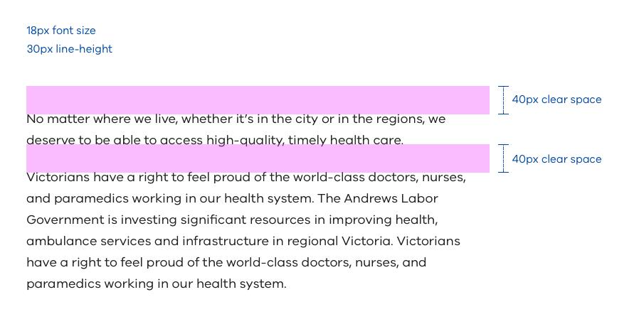
Body copy
All long form content, known as body copy, uses this style.
Specifications:
- 40px spacing above body copy
- 40px spacing between paragraphs
Why 18px font size?
We’ve selected 18px for body copy for a number of reasons.
- bigger text is more readable for visually impaired users and improves the accessibility of our websites
- modern screens are increasing in resolution every year which can make fonts look smaller. To counter this we make our body text slightly larger than the traditional 16px size
- larger font sizes can help to future-proof our website readability as screen resolutions continue to increase
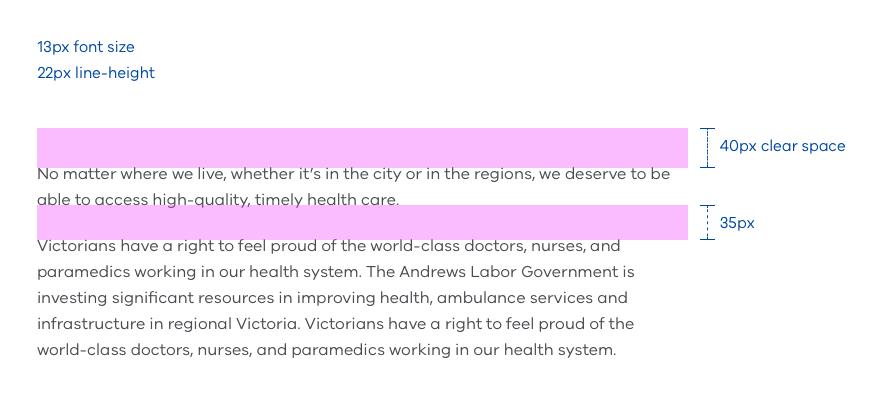
Small copy
Small copy is used mainly for ‘terms & conditions’ text or ‘fine copy’.
Line-length
Text can be hard to read when lines are too long.
Maximum line length:
As a general rule a maximum of 80 characters per line is recommended for body copy. At desktop size this equates to roughly a 700px wide column.
Unordered list
Bullet lists are an extension of body copy. There are some spacing rules, including indentation that are crucial to creating a nice bullet list. Bullet points are 5px (diameter) circular dots. Bullets may be a different colour to the main text. When selecting a bullet point colour, consider your sub brand palette.
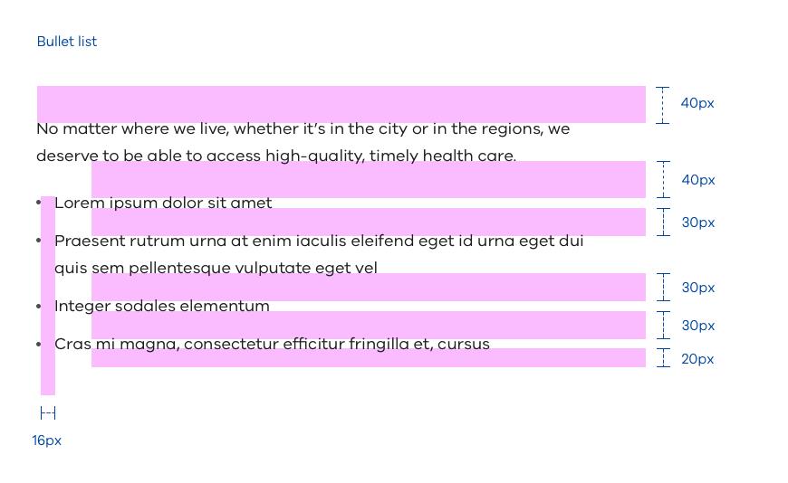
Specifications:
- 40px spacing above body copy
- 40px spacing between body paragraph and list
- 30px spacing between each list item
- 16px spacing between bullet and list item text
- 20px beneath list
Numbered list
The numbered list follows the same spacing rules and font styles as the bullet list, however we use VIC Bold numbers with a full stop, instead of bullets. Numbers may be a different colour to the main text. Again, consider the sub brand palette to inform colour decisions.
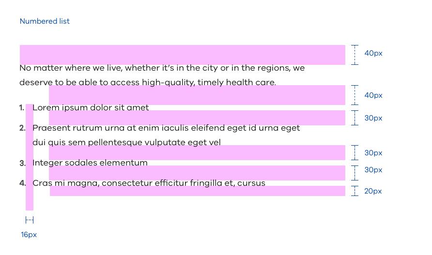
Specifications:
- 40px spacing above body copy
- 40px spacing between body paragraph and list
- 30px spacing between each list item
- 16px spacing between number and list item text
- 20px beneath list
Underlines and font colour
- text links on Vic Gov sites should almost always use an underline style – this makes links easier to recognise
- text links should also be a unique colour (such as blue or purple) to stand out from all other typography – this makes links easier to see
- both underlines and colour are important for users to recognise links clearly
When not to use underlines
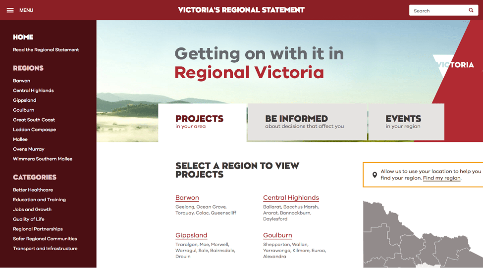
If your user interface is becoming too cluttered with links or it’s really not needed(i.e. main navigation of the website where links are obvious) then you may style links without an underline. Usually this style is reserved for site navigation (such as the examples below). When removing underlines ensure that your links are coloured appropriately so that links are still easy to recognise.

Side-bar navigation in this example above, does not use an underline style, it helps clean up the navigation visually so that it does not distract from the content of the page.
Links in the main menu ('Hamburger' menu on LHS) and the large tabs (Projects, Be informed, Events) do not use an underline style on the links. This is a because these elements are obviously links so removing the underline is acceptable and cleans up the design visually.
Headings vs text links
If it makes sense for a heading to also be a link (for example, it directs the user to a new page), then it should follow the text link guidelines above. If it makes sense for it to simply be a title (for example, it describes what is on the current page), then it should follow the heading rules.
For instance, if there were a series of question led prompts that helped the user navigate to specific information, it would make sense for these to be links, as the user would ideally, read the question led statement, agree, and click to find the relevant content (see below Study Melbourne example).
In the same example, it’s also good to note the H1 ‘Realise your potential in Melbourne’ would remain a H1 heading, as it doesn’t link the user to another page, it describes what is on the current page.
Some examples from the Study Melbourne website have been included below, to clarify exactly how both text links and headings can share the same font size, but work harmoniously across the one site.
Above: This approach demonstrates links are suitable for the content on the right. This is because the content is question-led and direct users to the answer on a new page. Because the main H1 heading is not a call-to-action it is not a link and therefore doesn’t use the underline style.
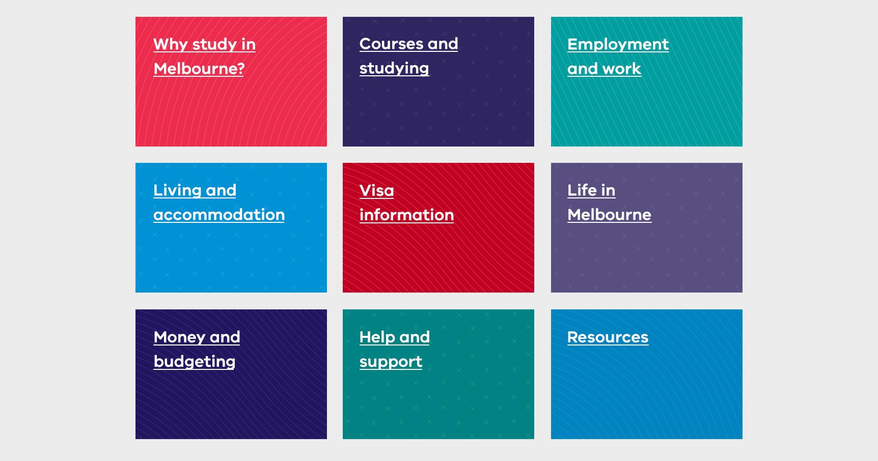
Above: These tiles are an example of in-page navigation. To ensure that users know these are clickable blocks the underline style has been used.
General styles
These styles are good starting points for using links on your site. Other sizes and styles may be created if necessary (for a unique piece of user interaction for example). Otherwise, choose from these:
Large text link
Used in site UI or where appropriate in bespoke page designs.
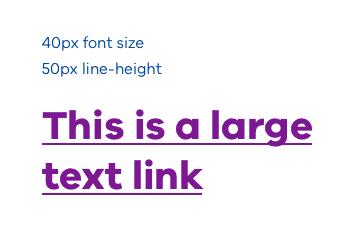
Specifications: 2px underline, 4px beneath text.
Medium text link
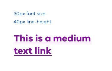
Used in site UI or where appropriate in bespoke page designs.
Specifications: 2px underline, 4px beneath text.
Small text link
Used in site UI or where appropriate in bespoke page designs.
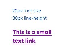
Specifications: 2px underline, 4px beneath text.
Body text links
Body text links can be used anywhere on a Vic Gov site. These are the main pathways between all of our content. These can be used under a paragraph of text, or within site UI as an individual link or as a list of links.
Since the style of body text links is subtler than normal text links, it is important to make sure these links stand out, by using a colour that is different to the body text. Recommended colours are blue or purple. When it comes to social media links, the exact brand colour of a social media site (such as Facebook, Instagram) may be used provided there combinations passes colour accessibility requirements.
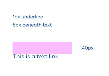
Specifications: 1px underline, 5px beneath text.
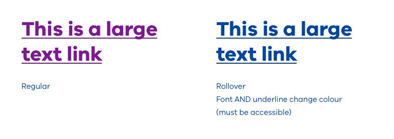
Text link rollovers
When a user hovers over a text link with their cursor the link should visually react and feel alive. To do this the text colour should have a noticeable change. Any accessible colour from the Brand Victoria palettes may be used.
Example:
When using combinations of typography, we use spacing rules that create good hierarchy. We call this Vertical Rhythm. Using correct Vertical Rhythm in our typography means that content is easy to digest and sections of an article are easy to distinguish.
If the spacing does not follow the recommendations outlined, it could result in content becoming ‘flat’ or unbalanced – where sections of the page bleed into one another, making long-form content very hard to digest. It may become unclear which titles, subtitles and/or body copy belong together, resulting in content which is confusing.
Using the right headings
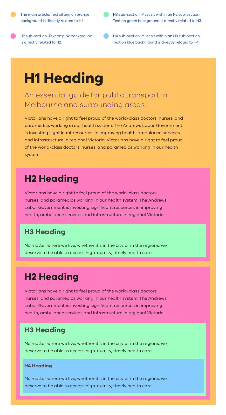
Font size plays a key role in Vertical Rhythm and hierarchy. Using the correct heading type is crucial. Think of headings as being nested – for example, you cannot have an H3 without an H2 above it.
When and where to use headings
- a ‘Title Heading’ is used for a large title – such as in a homepage hero banner
- an H1 heading should always indicate the page title or main topic of a page
- an H2 is used as a heading for a sub-section of a page
- if there is another ‘sub-section’ of the previous ‘sub-section’ use an H3 to introduce it
- if there is a further section beneath a ‘sub-section’ use another subsection introduced with an H4 heading
- if there is a further section beneath an H4 ‘subsection’ use another subsection introduced with an H5 heading
- ‘Subtitles’ and ‘Body copy’ sit beneath headings
Typography definitions
Title Heading:
- H1: Heading 1
- H2: Heading 2
- H3: Heading 3
- H4: Heading 4
Vertical rhythm is important
Proper typographic spacing is critical in establishing hierarchy; it can make the difference between confusion and clarity for the reader.
The rule of proximity is followed in our system: related (or more closely related) items appear closer to each other than unrelated (or less closely related) items.
This is is funnelled down through our typography system and its spacing rules. If the correct spacing rules are applied articles will be broken down into digestible ‘sub-sections’ and be very easy to read.
Correct spacing and hierarchy examples:
Above example without annotations:
Examples showing how spacing and headings break an article into sub-sections:
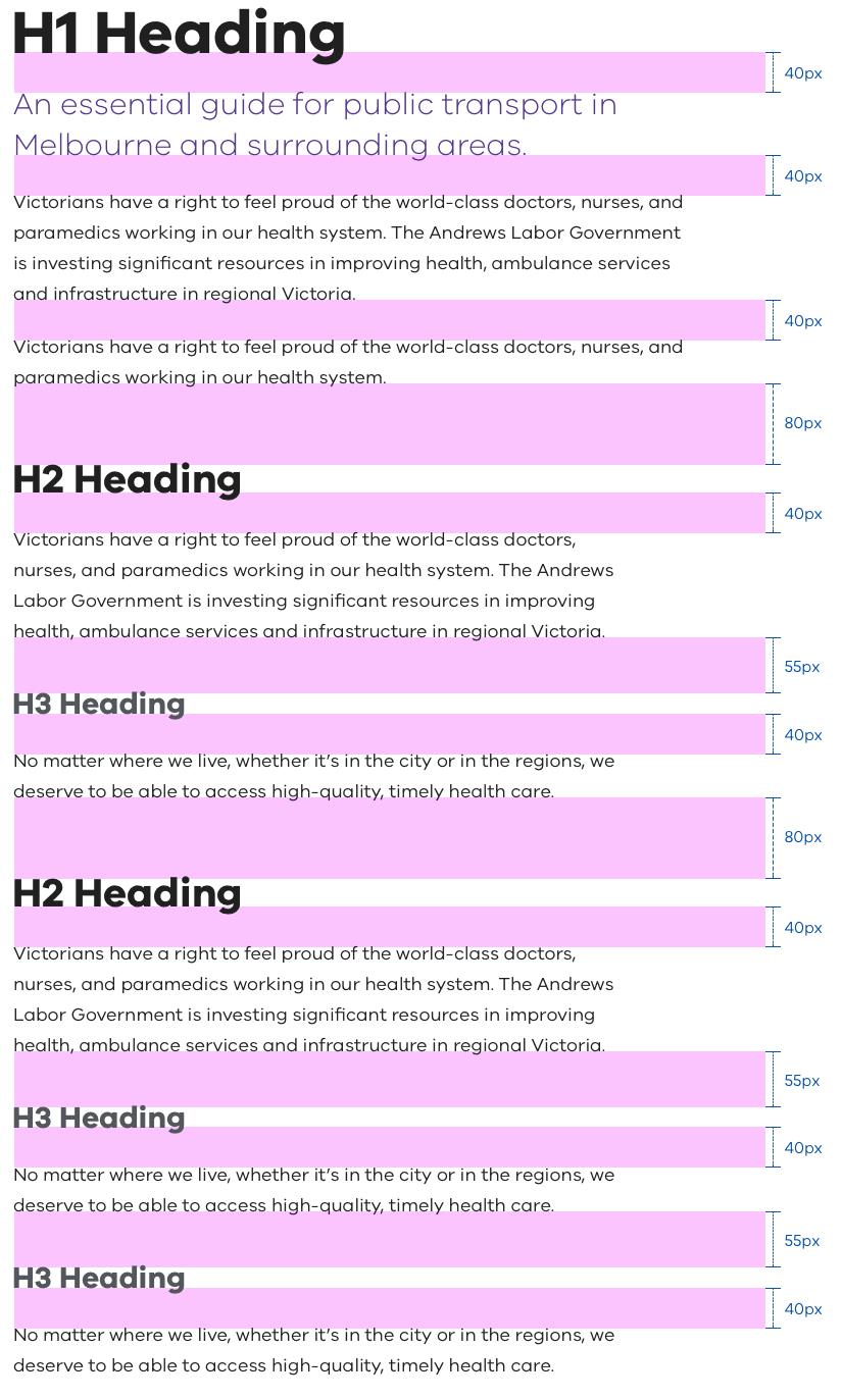
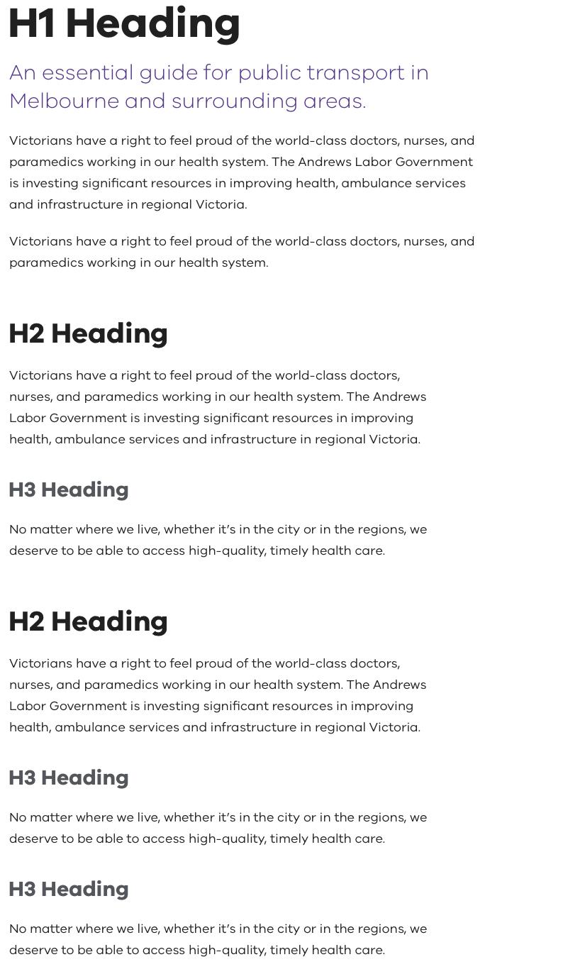
In this first example you can see that the first paragraph of intro text and body copy is directly related to the H1. This content provides an overarching frame to the rest of the article.
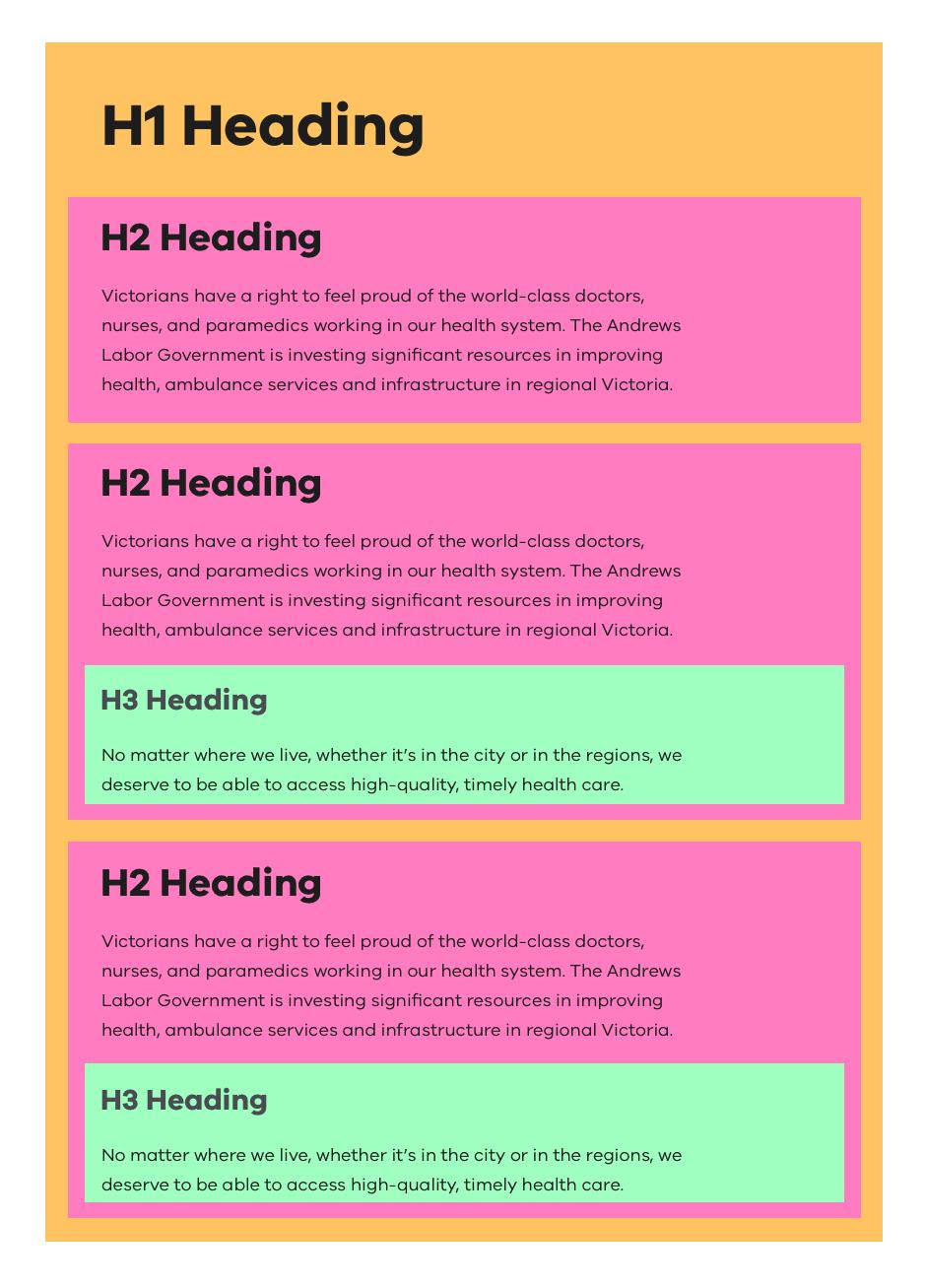
In this second example we don’t have any intro text and jump straight into an H2 sub-section. Because of this the space between the H1 and the H2 is larger. We use this amount of spacing so that H2 sub-sections are broken up equally throughout the article. H2 headings will always have the same amount of white-space above them – which makes the reading experience predictable and consistent.
The white space between each section lets the user know that a new section is beginning.
What not to do:
Here we have a correct example of Vertical Rhythm and an incorrect example side-by-side.
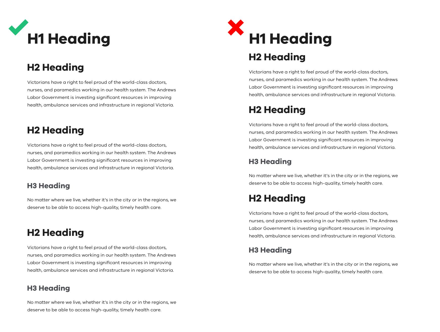
In the incorrect example you can see that the sub-sections of the article are harder to distinguish because there is less spacing between each section. Using different headings alone is not enough so correct Vertical Rhythm must be followed to achieve greater readability.
In the correct example we have used a larger amount of spacing between the H2 sub-sections which breaks them up into more clearly defined blocks. This makes comprehension of the article's structure much easier to understand.
Font colours and accessibility
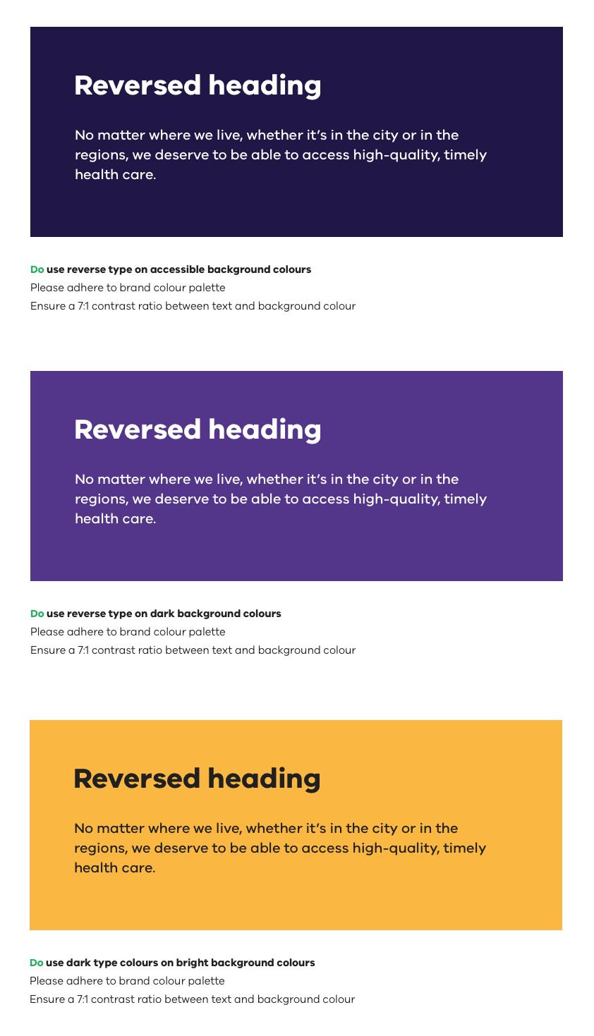
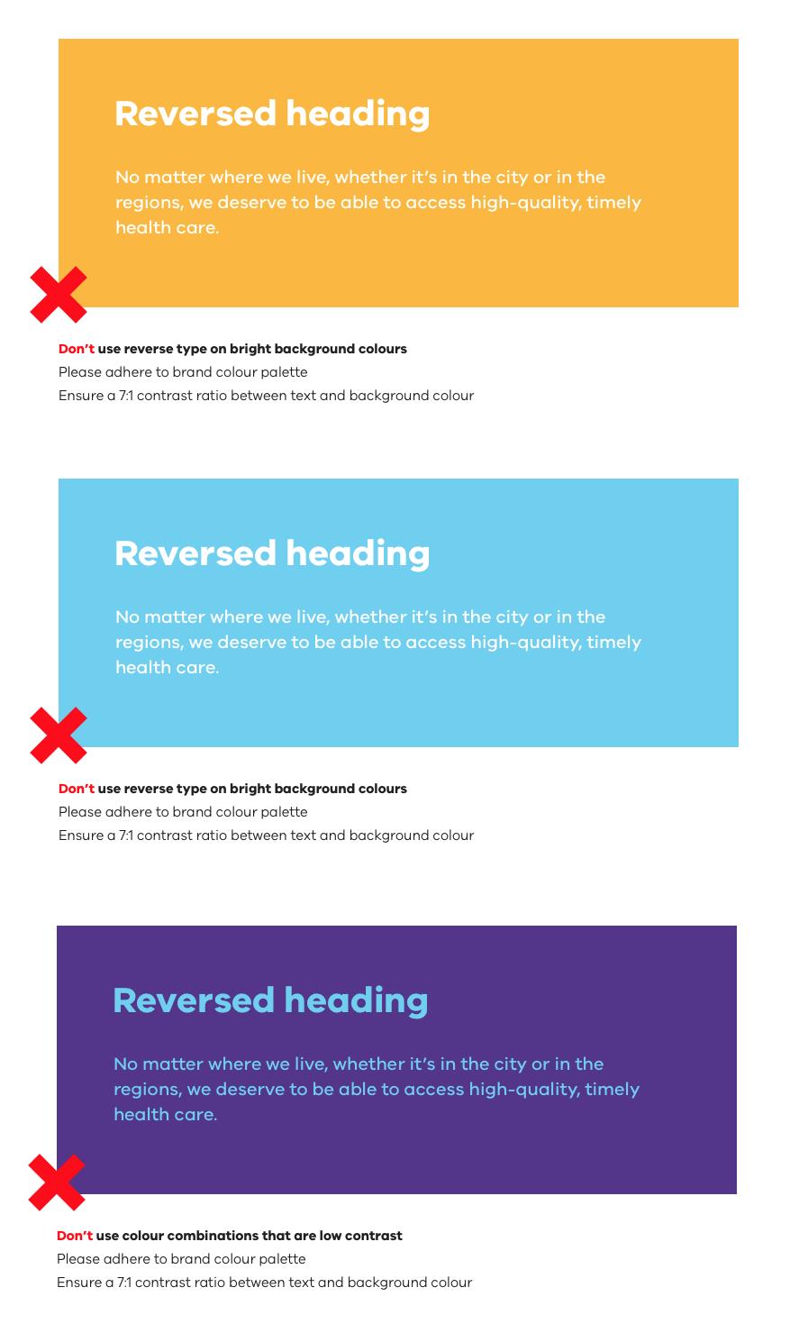
All text on Vic Gov websites should meet a minimum WCAG 2.2 level AA colour contrast ratio. This ensures all text on these websites is easy to read for people with a vision impairment.
WCAG 2.2 level AA requires a contrast ratio of 4.5:1 for normal text and 3:1 for large text (14 point and bold or larger, or 18 point or larger). Level AAA requires a contrast ratio of 7:1 for normal text and 4.5:1 for large text.
If text appears on a white (or very lightly coloured background) please ensure it is using one of the following colours.
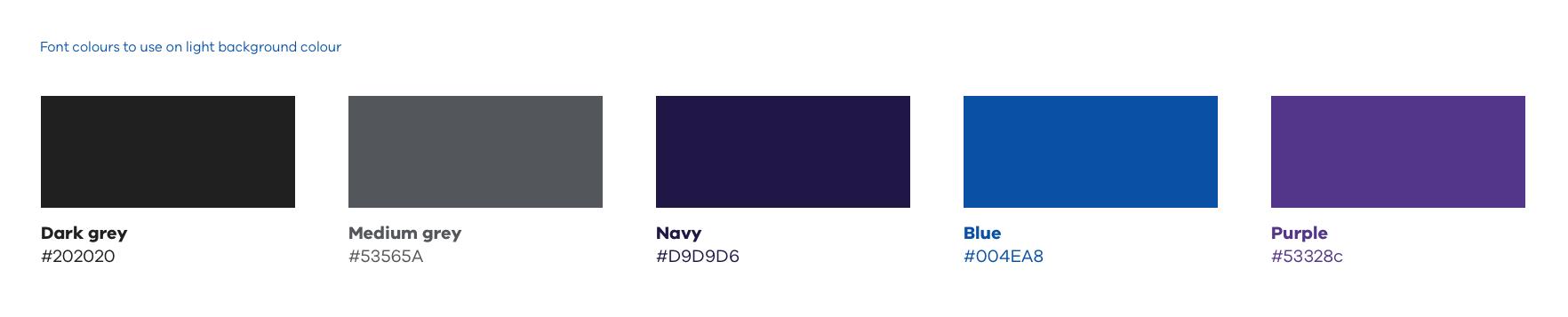
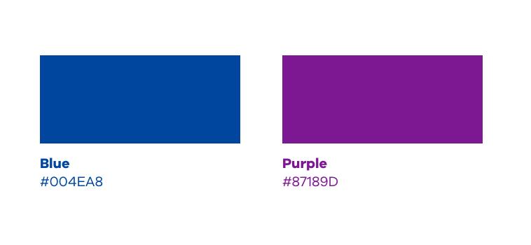
Good contrast is especially tricky to maintain when using text on a coloured background. When picking a background colour and font colour combination, ensure that you’re using colours from the masterbrand palette that have a 3:1 minimum contrast ratio for font-sizes 18px and over.
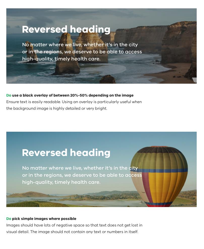
What to do:
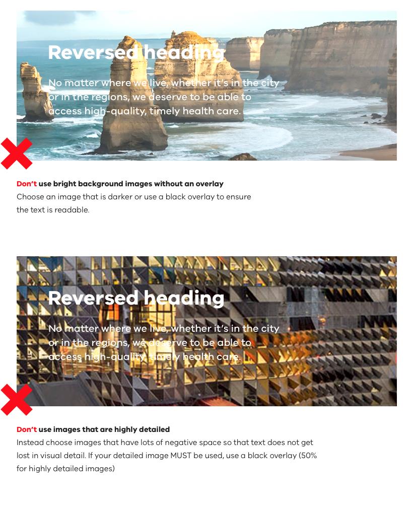
What NOT to do:
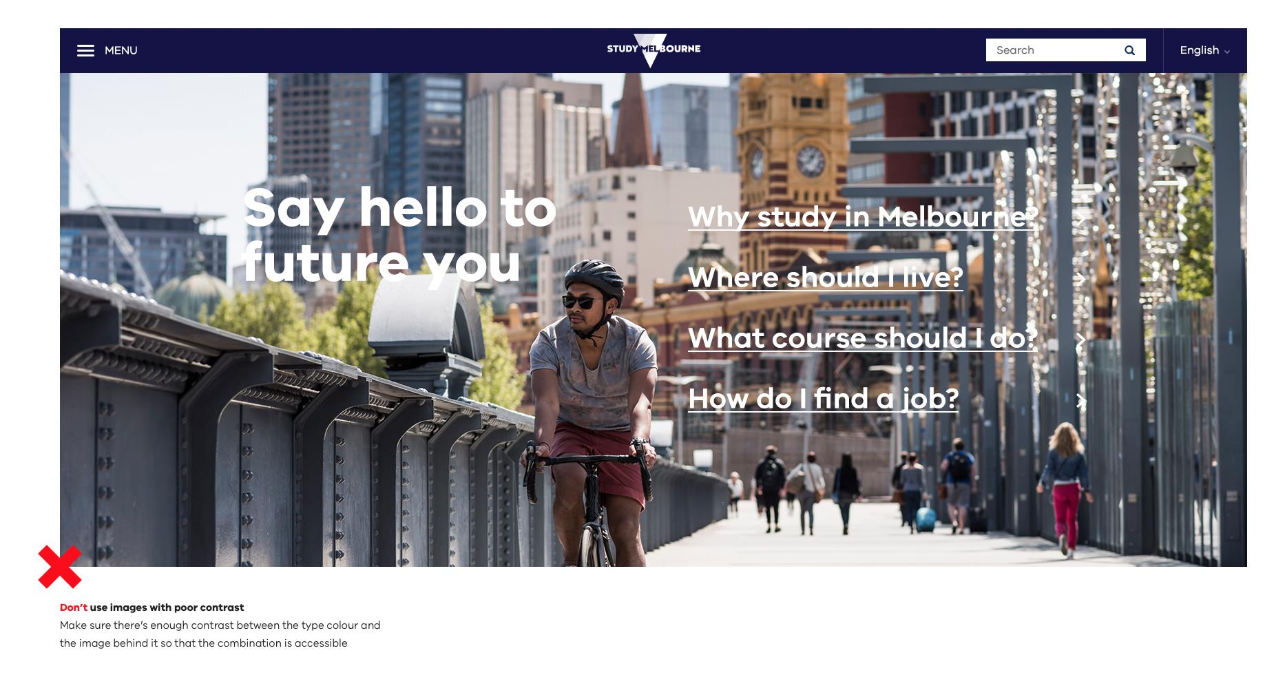
The realities of modern marketing and design mean that we’ll need to put text on top of images at times. If you can avoid this and only use text on top of flat colours that option will always be more accessible. Using text on top of images for sites that must be ‘guaranteed’ accessible is NOT recommended.
What to do:
What NOT to do:
Colour combinations between type and background should be chosen carefully to ensure they are accessible. Both the primary and secondary Brand Victoria colour palettes have been tested against WCAG AA and WCAG AAA . The results are noted in the following document:
Digital Standards: Accessible colour palette(opens in a new window)PDF 189.5 KB
Updated