The below guidelines apply to all social media channels including:
Profile images
The social media presence for your brand should adhere to the following. The framework ensures that all Victorian Government departments, entities and brands are tied together in a consistent way.
Depending on your placement within the brand architecture your social media visual presence will be determined by the appropriate template.
Specifications:
1000px x 1000px
Note: most social media sites will ask for a file of much lower resolution than this. However, to future-proof our social media profile images, we’ve recommend creating them at this size.
All profile images should be uploaded uncompressed.
Correct logo use on social media
The 'V' mark images below should be used in its most basic form in all social media profile images.
This means that the 'VIC' or 'MEL' versions should be used.
Other logos with more words such as 'Study Melbourne' or 'Victoria, Australia' should NOT be used. The text will be too small to read on mobile devices.
The size and placement of the 'V' mark should be exactly as it appears in the templates below. That means that the top of the mark should sit 174px from the top of the profile image and 88px from the bottom of the profile image. It should also be horizontally centered.
Using the correct size and placement is very important and helps to maintain consistency across all of our social channels.
Masterbrand
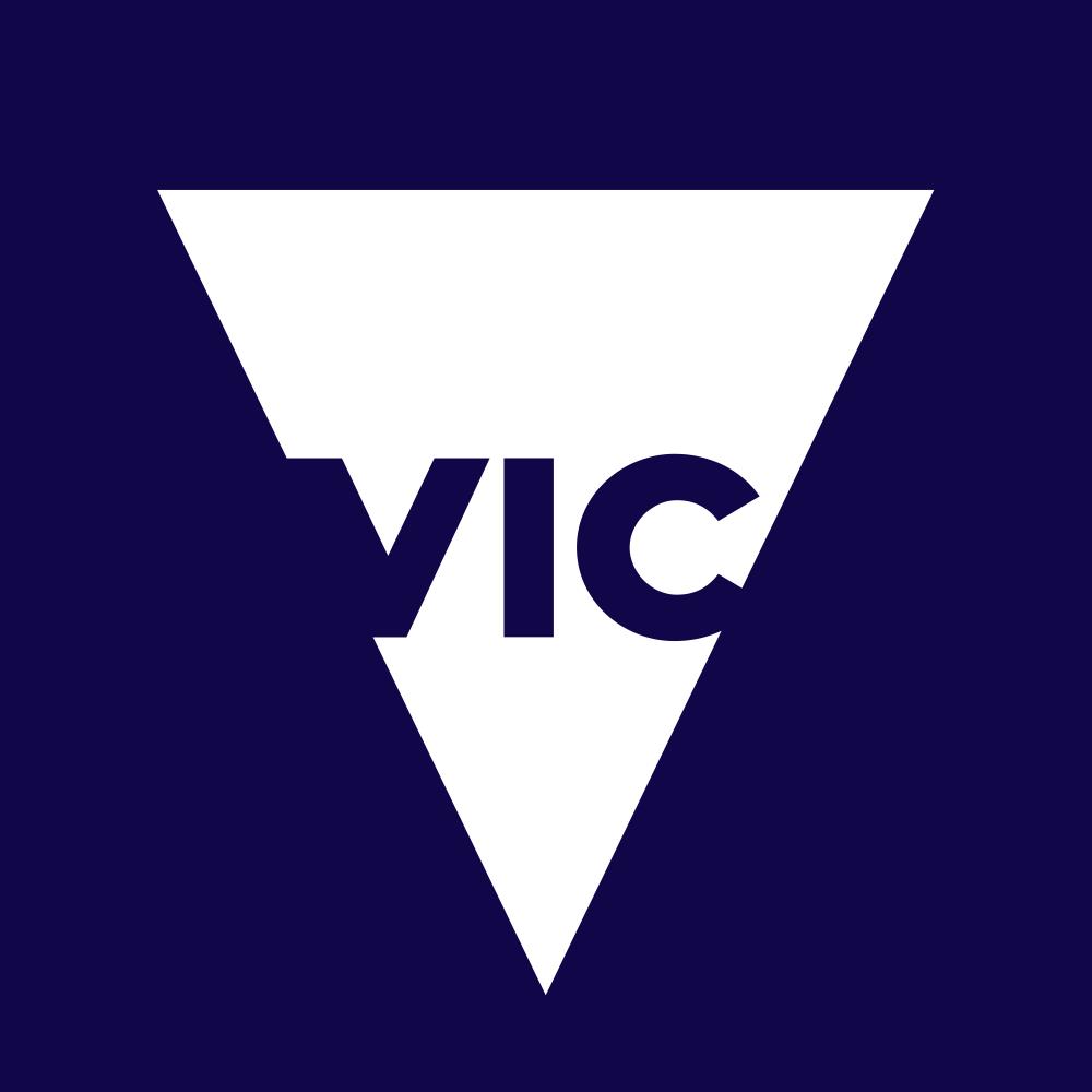
This avatar represents the State of Victoria. Contains the V mark on the masterbrand colour. No textures or background images should be used.
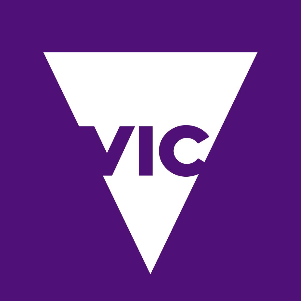
State Government

Contains the V mark on the Victorian Government brand colour. No textures or background images should be used.
Government departments
Contains the V mark on the associated brand colour for the chosen department. No textures or background images should be used.
Government divisions and entities

Contains the V mark. Divisions and entities must also incorporate their branding through the use of the associated texture and colours for that brand.
Government initiatives
Initiatives that have their own brand, such as The Education State, may use their own branding and visual elements. Try to keep any imagery or text as simple as possible - fine detail will be lost.
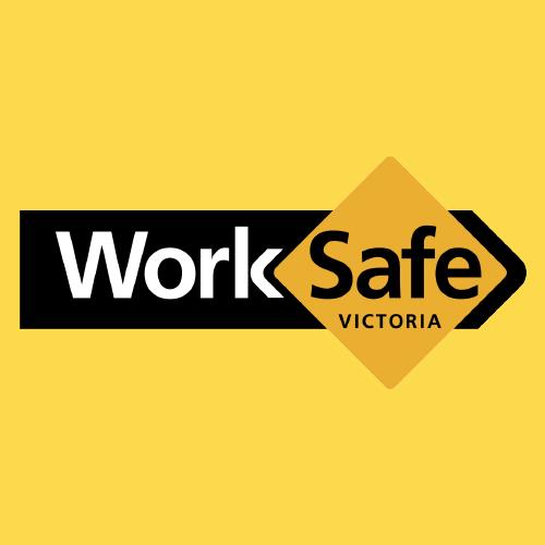
Statutory authorities and government-owned corporations and independents
Organisations that have their own brand, such as WorkSafe Victoria, may use their own branding and visual elements.
Destinations
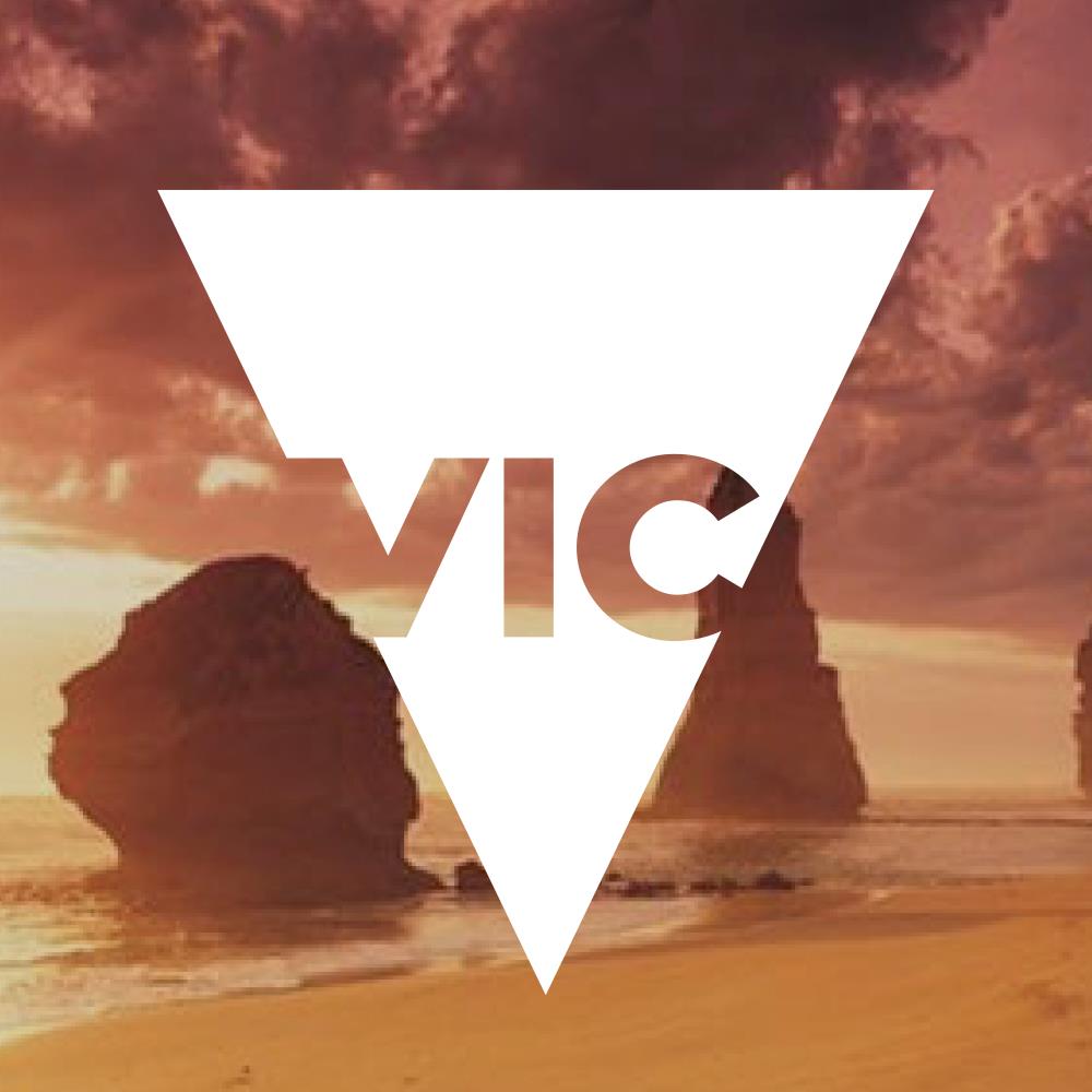
Destinations should use the “V” mark with a photo of the location in the background. If the photo is too bright and the “V” mark becomes unreadable, please use a 15% black overlay on the background image.
Campaigns
Campaigns should use the ‘V’ ('VIC') logo with associated brand colours/images in the background.
International campaigns
When representing Victoria internationally the 'V' mark (with 'MEL') should be used. The background should take elements from the campaign branding materials – this could be a photograph, pattern or colour.
Non-V-branded entities
If your organisation has it’s own independent identity and logo (and does not use any form of the “VIC” logo) the above guidelines don’t apply to you. You’ll need to find a way to best represent your brand in social media avatars that follows the following guidelines:
Keep your avatar as simple as possible
Your avatar should only have one key element and this is almost always the logo of your organisation. It’s a good idea to simply use your logo on a background colour (the background colour should be taken from your organisation’s brand guidelines).
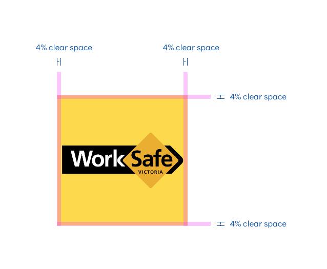
If there are multiple variations of your logo, you should always use the simplest form of your logo in the avatar (the one with the least detail as possible). In our example for Worksafe Victoria we’ve simply used the Worksafe logo on a yellow background colour taken from the brand guidelines.
Make sure your logo is large enough to easily read but doesn't touch the edges of the image. Aim to have clear space of at least 4% around any logo in your avatar. Here’s a good example:
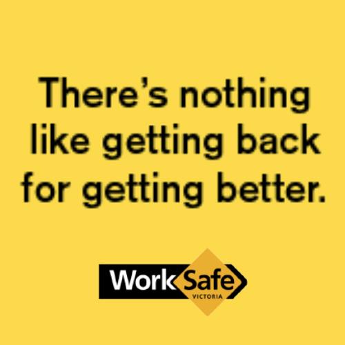
Don't include extra text or messages
Because social media avatars are displayed at very small sizes please refrain from using lots of text. It will be very hard to read in practice, so will not be helpful to end users.
Note how the text is unreadable in the example above and the Worksafe logo has now also become indiscernible.
Use a simple, recognisable brand element (like shapes or graphics)
If you have a strong graphic branding element like shape, pattern or colour you may use this instead of a logo or as the background to your logo (ensure that the background is not obtrusive to the logo). Here’s a good example:
Avatar for ‘Creative Victoria’.
Other good examples

Avatar for ‘Film Victoria’. Note it simply uses the logo on a solid red background.

Avatar for ‘National Gallery of Victoria’. Note the simple logo and the non-obtrusive brand pattern in the background.
Naming social media pages
Use the following naming conventions when creating social media pages. This will ensure all pages work together as a cohesive set and all government pages adhere to basic best practice.
Use the clearest form of your name
Some departments and organisations are known by several different names. Use the clearest form of your name (which may not always be the shortest).
For example:
- do write: Department of Health & Human Services
- don’t write: DHHS
Don’t abbreviate
If the abbreviation of your organisation's name is not commonly known, it may make the page difficult to locate.
The word Victoria should always be written out in full in any page title. Do not abbreviate to ‘Vic’.
Use ‘&’ not ‘and’
The word ‘and’ should be written as an ampersand (&) in all page titles.
Use title case
Title case (that is, the capitalisation of the first letter of each word other than articles, conjunctions and prepositions) should be used in all page titles.
For example:
- do write: Department of Health & Human Services
- don’t write: Department of health & human services
Add clarifying information
For government departments or entities with equivalents in other states (including the national level) include the word ‘Victoria’ at the end of the department title, preceded by a comma.
For example:
- do write: Department of Health & Human Services, Victoria
- don’t write: Department of Health & Human Services Victoria
When extra information is needed to qualify the audience of the page (for example, in the case of Energy Safe Victoria) the qualifying information should be separated from the title by an en dash with spaces either side (that is, Energy Safe Victoria – Electricians)
Unless it’s incredibly important that extra information is added for clarity, don't add any extra elements within the name.
For example, don't write ‘Crash Test Dummies - how safe is your car’. If the campaign is named ‘Crash Test Dummies’ then it's important that its Facebook page is also given that name.
Updated