When we refer to navigation we’re generally referring to the main strip at the top of a site that contains elements like links to the main sections of a site, search and the sites name or logo. The navigation of a site is highly dependent on who is using the website, and why they’re using it.
This means there is no one answer to how navigation should be designed. However, we should ensure Victoria Government websites are consistent at a basic level.
When designing your main navigation bar, often the most suitable approach will be to follow the guidelines outlined below.
Main navigation base style and layout
- 70px in height. Full horizontal width of site.
- Uses brand colour as background colour.
- Hamburger ‘menu’ icon on the left-hand-side. This ensures that navigation will be consistent across mobile devices and desktop. When clicked this will open a side-bar style menu that contains an appropriate menu style and layout for the website’s information architecture. Sometimes a hamburger menu will not be appropriate and text links will need to appear on the main navigation.
- Logo in the center.
- Search functionality on right-hand-side – as a field on desktop, icon on mobile.
Desktop main navigation
Some sites may not require a traditional navigation bar, and that’s fine. But if you are using a traditional navigation bar, there’s a couple of things to consider. These guidelines are particularly important for brands aligned closely to the masterbrand. Not all sites require these elements in the main navigation, depending on the project.
Common elements
- Hamburger menu
- Logo
- Search box
- Language selector
Specs
- Must have a minimum height of 70px.
- Must be full width (span across the full horizontal width of the website).
- Should incorporate the brand (or sub-brand such as TradeVic) colours.
Icons vs labels in navigation
Iconography or labels or a combination of both can be used for elements in the navigation bar.
There are two key rules to follow with iconography:
Rule one: Be consistent
- If you choose to use just icons, don’t label one and not the others.
- If iconography is chosen, ensure all icons are of the same height.
- If labels are used, ensure the font weight and size is consistent. Unless there is a good reason to do otherwise – is one particular element more important?
Rule two: Use recognisable icons
- Using iconography that is obvious and follows convention, making it easier for the user to interact with. For example, it is recommended a magnifying glass be used for search and a hamburger (three horizontal lines) be used for a menu.
- Use text as well as the icon. For example, it is recommended that the word 'Menu' be placed next to a hamburger icon so it’s clear what it is.
- Anything obscure or hard to recognise will make life hard for the user.
Positioning elements
- Keep in mind other guidelines like typography hierarchy. For example, using correct spacing around menu items.
- Align or balance text, iconography and other elements such as language selector and search bars).
- When positioning items within the navigation bar, be sure to keep spacing consistent and use correct hierarchy.
- Search is usually placed in the top right corner of the navigation as this is standard web practice. The visual style of the search field itself will depend on the project requirements.
Logo positioning
Avoid awkward spacing/padding around the logo. It should be clear the logo is either sitting within the navigation bar OR overhanging (extending beyond the navigation bar). If your logo overhangs make it clear and intentional but not obstructive to elements that sit under the navigation bar. Only logos with the ‘V’ should overhang. If the logo does not contain the ‘V’ ensure that it sits within the navigation with appropriate clear space.
- The standard logo size in navigation headers is 60px high – width varies depending on the specific logo.
- Where it makes sense, the logo may be larger than 60px high.
- The position of the logo is not fixed, however it is generally placed in the center of the navigation or on the left hand side. Try to avoid placing the logo on the right hand side of the navigation.
A good navigation bar example:
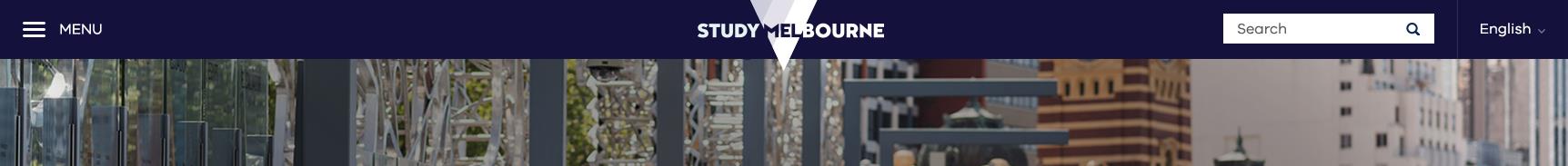
The logo here obviously overhangs (bleeds off the bottom edge), so it feels intentional and confident – if it were to overhang by only a pixel or two it would feel like a mistake.
- The navigation bar uses the main brand colour – this helps bring brand identity into the site.
- We’re using iconography meaningfully and the search box appears large enough to easily use.
- Elements are well balanced across the width of the bar.
In this case we’ve incorporated the 'V' logo into the hero banner rather than in the main navigation. Only use this option if the main navigation is not the right place for your brand to be incorporated or if the name of the site needs to take priority over the associated logo.
- The navigation bar uses the main brand colour – this helps bring brand identity into the site.
- We’re using iconography meaningfully and the search box appears large enough to easily use.
- Elements are well balanced across the width of the bar.
Search box
Search functionality on right-hand-side – as a field on desktop, (or as just an icon on mobile - when tapped a search field should open, design of this depends on project).
- Search is usually placed in the top right corner of the navigation as this is standard web practice.
- The visual style of the search field itself will depend on the project requirements.
- Magnifying glass icon must be used inside the search field on the right hand side, this is a web standard. When it is clicked on it should begin the search.
- Search box should be a minimum of 240px wide and 38px high on desktop to ensure it’s easy to use.
Navigation example:
Mobile navigation
Navigation should be as consistent as possible across desktop, tablet and mobile in general appearance. This means that the general look and feel should be matching and fonts and functionality should be the same. Rules and specifications applying to mobile also apply to portrait-tablet. Landscape tablet should follow the desktop design.
Specifications
- Must be a minimum height of 100px to ensure it’s functional.
- Must be full width (span across the full horizontal width of the website).
- Should incorporate the brand (or sub-brand such as TradeVic) colours.
Iconography
Since space is a premium on mobile, you might want to consider icons in your navigation bar, even if you used labels on desktop. A few guidelines you may want to consider are listed below.
- When selecting icons, follow convention to ensure the navigation bar is functional (e.g. using a magnifying glass for search).
- Icons with an equal width and height work really well, as opposed to icons that are either significantly tall or wide. Aim for consistent icon height
- consider labelling icons with words. For example, use the word ‘menu’ next to the hamburger icon.
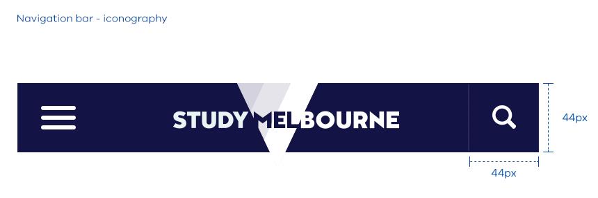
- Tappable items must be no smaller than 44px by 44px. The icon itself doesn’t have to be 44px, but the tappable area should be at least 44px by 44px. For example, you could aim for a minimum icon height of 30px, with sufficient spacing around it to add up to 44px. See the 'Study Melbourne' example below:
Logo positioning
To maintain logo legibility the logo may be locked up tightly on mobile – this means that clear space around the logo is not necessarily needed. If your logo overhangs make it clear and intentional but not obstructive to elements that sit under the navigation bar.
Updated