Minimum elements
Your footer should contain these items:
- Victorian Government (or relevant) logo
- required policies and notices: Accessibility, Disclaimer, Freedom of Information, Copyright, Privacy
- contact information (link to page or phone, email, address details)
- sitemap
Other common elements
- About us (if it’s not already in the main navigation)
- Links to relevant social media channels
- Back to top link (takes user to the top of the page)
Hierarchy of content
The footer is a form of secondary or tertiary navigation on a website. It contains links that are important for legal information.
If contact information or other elements are more important to highlight in the footer then those should come first.
The Victorian Government logo gives authority to the website so visitors know it’s official and can be trusted. It’s usually placed in the bottom right corner.
Other elements like contact information or links to social media may be mixed in with important links.
Fine print and copyright information should usually come last.
Visual style
There is no predetermined style for the footer. However there are some general guides to follow:
- make sure the footer stands out from the main body of the page. For example, if your page background is white, use a contrasting colour for the footer
- footer links should normally be the same size as the body copy on your site (normally 18px)
- categorise links in the footer using headings - this may or may not follow the site structure (site map)
- use the ‘small copy’ paragraph style for fine print if it’s less important
Good example
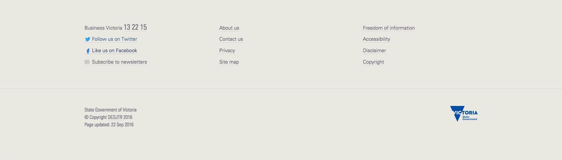
Why the footer above works
- the background colour of the footer (warm grey) is different to the rest of the page (blue).
- the most important links on the site are clearly listed.
- the important details (phone number, social media, newsletter) are given prominence.
- the logo and fine print are further down the footer and are less prominent.
- the footer is not cluttered
Updated