Brand Victoria encompasses a vast range of divisions and entities with different brands. These brands are positioned on a scale, depending on how closely aligned or independent they are from the Masterbrand. The diagram below explains this concept.
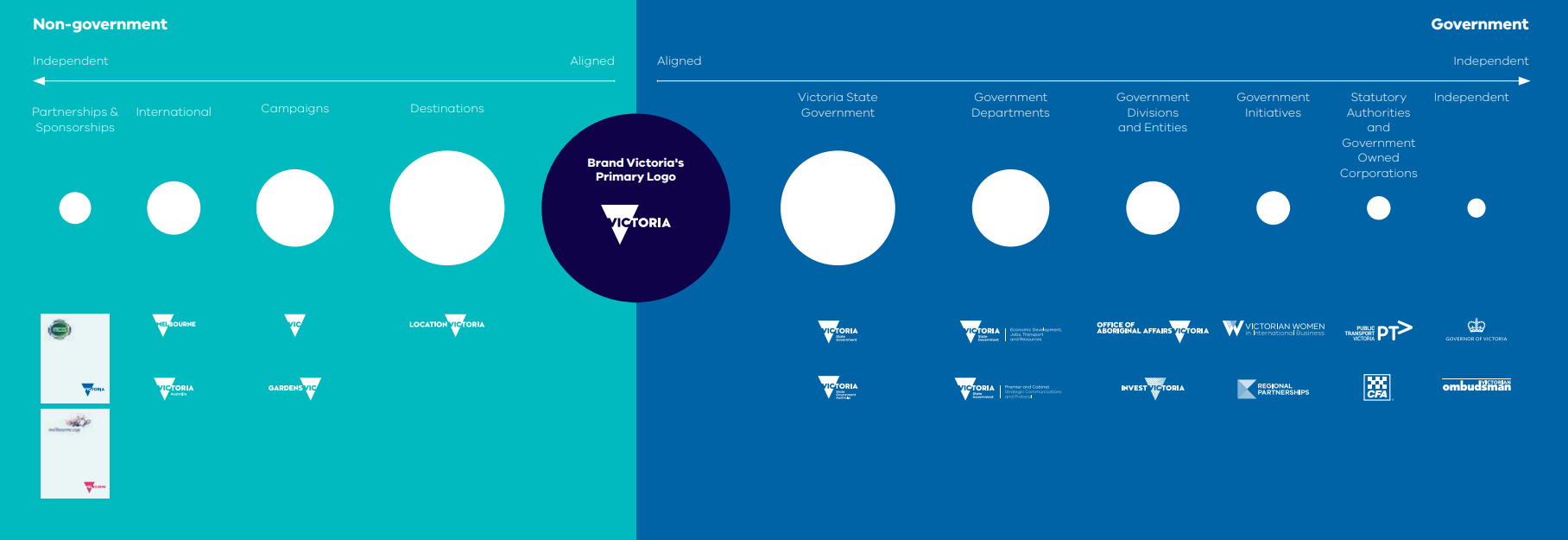
Above: Brand Victoria Architecture
The closer a sub brand is positioned to the Masterbrand, the closer the brand guidelines must be followed. As a sub brand moves further away from the Masterbrand, the less important it becomes to follow these guidelines to a T.
For example, Victoria State Government sub brands are aligned very closely to the Masterbrand, which means they should not deviate from these guidelines. In practice, this means using a standard navigation bar, applying exact measurements of components like buttons, incorporating all required logos and sticking to the assigned primary colour palette.
On the other hand, independent sub brands can be looser with these guidelines, as they are positioned at the furthermost end of the scale. These brands may not need to include a standard navigation bar or use the standard VIC typeface. Independent brands should seek out their specific sub brand guidelines to inform choices for typography, colours, patterns, and so on.
Updated