The Basic text component is where you add the main body content for your page. Learn more about using the basic text component.
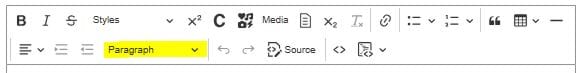
The toolbar in this component can be used to add:
- bold or italics formatting
- headings
- hyperlinks
- buttons
- lists
- quotes and callouts
- basic tables
- embedded media (images, videos and documents)
- iFrames
Below are examples of some of the commonly used formatting options. For instructions on how to apply these options in the CMS, read our user guides on the SDP help centre.
Heading styles
The above heading is Heading 2. To apply a heading you simply need to put your cursor anywhere in the heading and click the dropdown labelled 'Normal'. Choose from the styles in the dropdown list. Learn about applying heading styles in the CMS.
Heading 3
For accessibility reasons as well as to help user comprehension, headings should be heirarchical. This means initial headings on a page should be Heading 2 size, and any subheadings should be Heading 3. Never start with a Heading 3 on the page, or add a heading 4 after a heading 2.
Heading 4
Never skip a heading level just because you like the way it looks. This creates an accessiblity issue.
Heading 5
If you're using heading 5s your content probably needs a restructure!
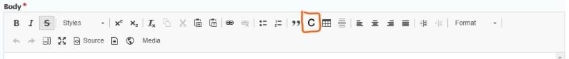
Quote styles
We have two quote styles, labelled as "Block quote" and "Blockquote with 2 lines of caption" in the toolbar.
Block quote – an indented section of text
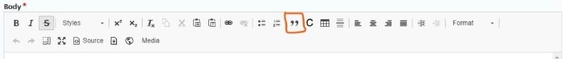
This example is created using the icon with the double quotes on it (rollover label is 'block quote'). It displays with both a left and right indent.
Blockquote – used for direct speech
This is the block quote with 2 lines of caption, to indicate a quote directly attributed to a person. You insert it and then replace the dummy copy with your content.
Callout styles
Single paragraph callout
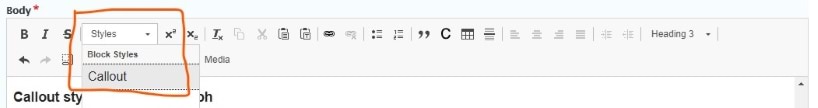
This paragraph has the Callout style applied to it. Use it to highlight short pieces of text. It doesn't allow line breaks, headings or lists and it can be difficult to read large passages in this style. It only displays well for a single paragraph.
WYSIWYG callout
When to use
This callout style should be used when you have:
- more than one paragraph
- additional formatting, such as headings, lists and hyperlinks.
List formatting and nesting
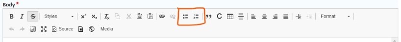
Numbered list
- Select your text and click on the numbered list icon.
- When you have a numbered list, you can click the indent icon to push selected list items to the next level down.
- second-level numbered list (lower case alpha)
- another list item
- third-level numbered list (lower case roman numerals)
- another list item
- another list item.
Bulleted list
- First-level list style displays as a solid dot
- another list item
- second-level bulleted list displays as an en dash
- third-level also displays as an en dash
- this level is hard to comprehend
- so only use if you have to exactly replicate legislation
- second-level bulleted list displays as an en dash
- a list item back at first level.
Buttons
There are 2 button options: primary and secondary. The only difference between them is the colour.
If using 2 buttons in the same section on a page, use the primary button first and then the secondary button to differentiate them.
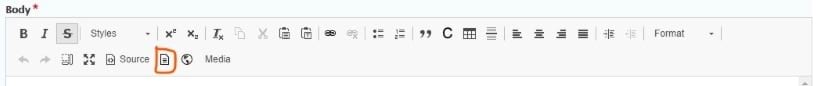
Embedded media

Image
An example of an image embedded with a caption. If you choose embedded with caption, it will display the image's original caption that exists in the media item. If you just choose embedded, you can add your own caption on the embed screen. Here we can see both!

Documents
When you embed a document it will display an icon, the file type and file size.
These files were embedded before the alias was added. Roll over the links of the files above and below to see the URL path.
Here is an inline link to the sample doc.
Here is an inline link with an alias to the sample PDF.
Here is an inline link with an alias to the sample xlsx.
You are also able to choose whether to display the date that the file was last updated. This should be used when an important file is regularly updated so users can easily tell that it's the latest version.
Files
What's the difference between file and document in the CMS when uploading a media item? (I like to use file for zips as they are not necessarily 'documents' could be a bunch of images or other file type.)
There should be a difference on frontend for what icon displays. Also in backend the two are displayed differently after embedding.
Here's a file embed. Settings used include display last update date checkbox - no longer working?
Video
An example of a video embedded with a transcript.
Iframe
Here's an example of a podcast embedded using the iframe button (the one that has heard, music, camera and lightning icons).
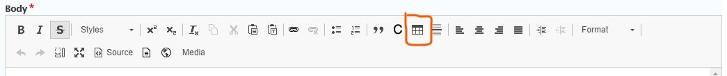
Tables
This information is about creating tables using the basic text component. Learn how to set column width and alignment.
There is also a separate component for data tables, which you can see on the Sample of all SDP components page.
First row set as the header
| Column 1 | Column 2 | Column 3 has quite a long heading | Column 4 |
|---|---|---|---|
| Row 1 content | row 1 content | You can right-click on the table to access options such as deleting or inserting rows. | 1,234,567 |
| Row 2 content | row 2 content |
| 384 |
| Row 3 content | row 3 content | Merging cells affects accessibility so is not recommended. | 568,658 |
First column set as the header
| Column 1 (as header) | xxxxx | yyyyy | zzzzz |
|---|---|---|---|
| Next heading | x | y | z |
| Next heading 2 | x | y | z |
| Next heading 3 | x | y | z |
| Next heading 4 | x | y | z |
Both set as headers
| Column 1 (as header) | column 2 | column 3 | column 4 |
|---|---|---|---|
| Next heading | x | y | z |
| Next heading 2 | x | y | z |
| Next heading 3 | x | y | z |
| Next heading 4 | x | y | z |
No headers
Use this option sparingly as this can be an accessibility issue.
| wwwww | xxxxx | yyyyy | zzzzz |
| w | x | x | z |
| w | x | x | z |
| w | x | x | z |
| w | x | x | z |
Image thumbnail settings
1. Image just embedded, not embedded as thumbnail; size 800x800

2. Display as thumbnail - None (original image)
3. Display as thumbnail - large 480 x 480

4. Display as thumbnail - medium 220 x 220

5. Display as thumbnail - thumbnail 100 x 100

Updated