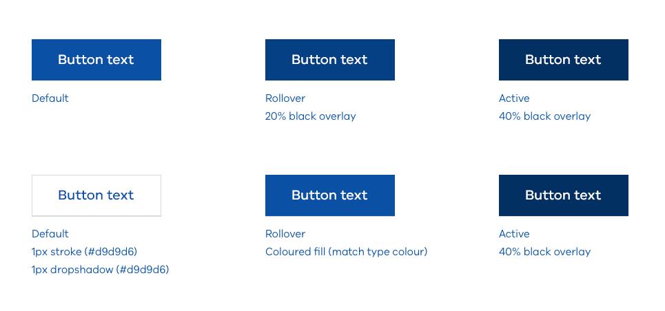
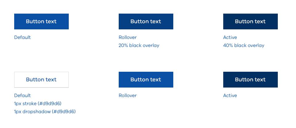
The buttons styles below should be used to ensure consistency across the Brand Victoria suite of brand. However, to add brand personality to a site, sub brand colours may be implemented to these styles.
Please refer to the WCAG accessibility matrices when selecting type and background colour combinations. Some specifications have been recommended, but these are just a guide and can be amended, depending on the sub brand.
Large buttons
Recommended specifications:
- type size: 20px
- font: VIC Med
- placement: Type should be balanced horizontally
- padding: 24px top, 40px right, 24px bottom, 40px left
- height: 60px – This is important. On mobile screens buttons need to be at least 44px in height to be easily tappable
Medium buttons
Recommended specifications:
- type size: 18px
- font: VIC Med
- placement: Type should be balanced horizontally
- padding: 20px top, 40px right, 20px bottom, 40px left
- height: 50px – This is important. On mobile screens buttons need to be at least 44px in height to be easily tappable
Maximum width (character limit)
To ensure buttons remain functional, it is recommended text within a button is limited to approximately 20 characters. If the required text exceeds 20 characters, it may still be used, but it may be worth evaluating the copy. If it’s crucial to the user experience button width may be increased.
We follow the Australian Government Style Manual: Links
Use concise keywords for call-to-action text or buttons. Accurately describe what will happen next
Updated