Brand fonts
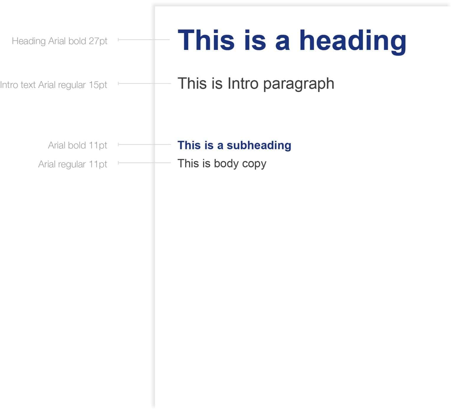
Primary font – Arial
Arial is the preferred font for use in all marketing and advertising applications.
Arial Regular should be used for body paragraphs, while headings should be in Arial Bold.
Design professionals
In cases where you have access to professional design software, Helvetica Neue is the preferred font.
Primary brand colours
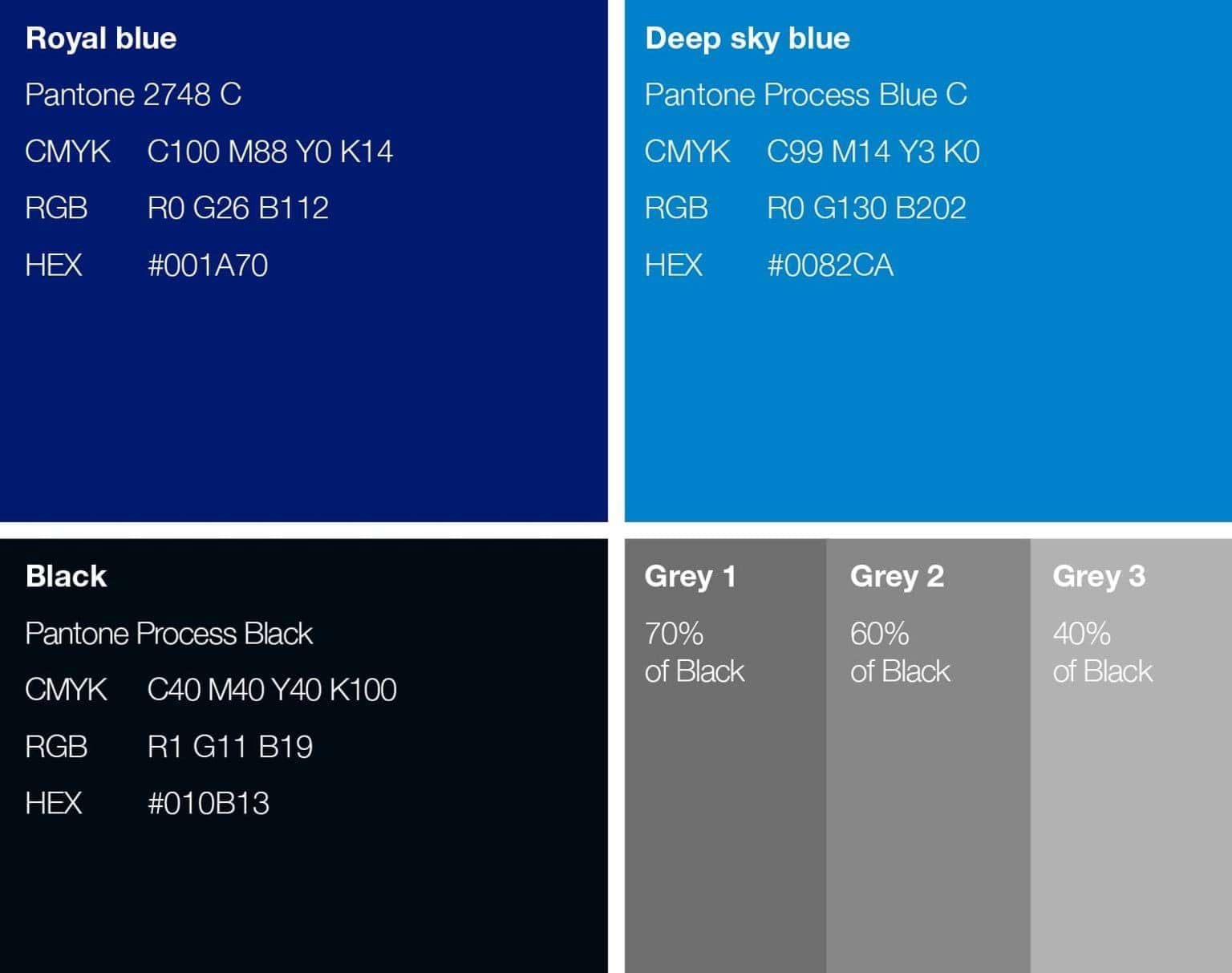
Our brand colours have been selected from the Pantone Matching System (PMS) to help in ensuring accurate reproduction across a broad range of media. The colour codes to the right translate these colours for use in application.
Pantone: The Pantone colour matching system ensures the most accurate reproduction of colour in print.
CMYK: When Pantone colours are not available for printing, the CMYK values shown should be used as a guide.
RGB: All screen media (TV, video, internet, mobile and PowerPoint®) should use the RGB values shown.
HEX: The colour references preceded by the # symbol are for use on the web and in html applications.
Note: This guide indicates approximate colour only. For accurate colour matching use the appropriate Pantone PMS guide.
Secondary brand colours
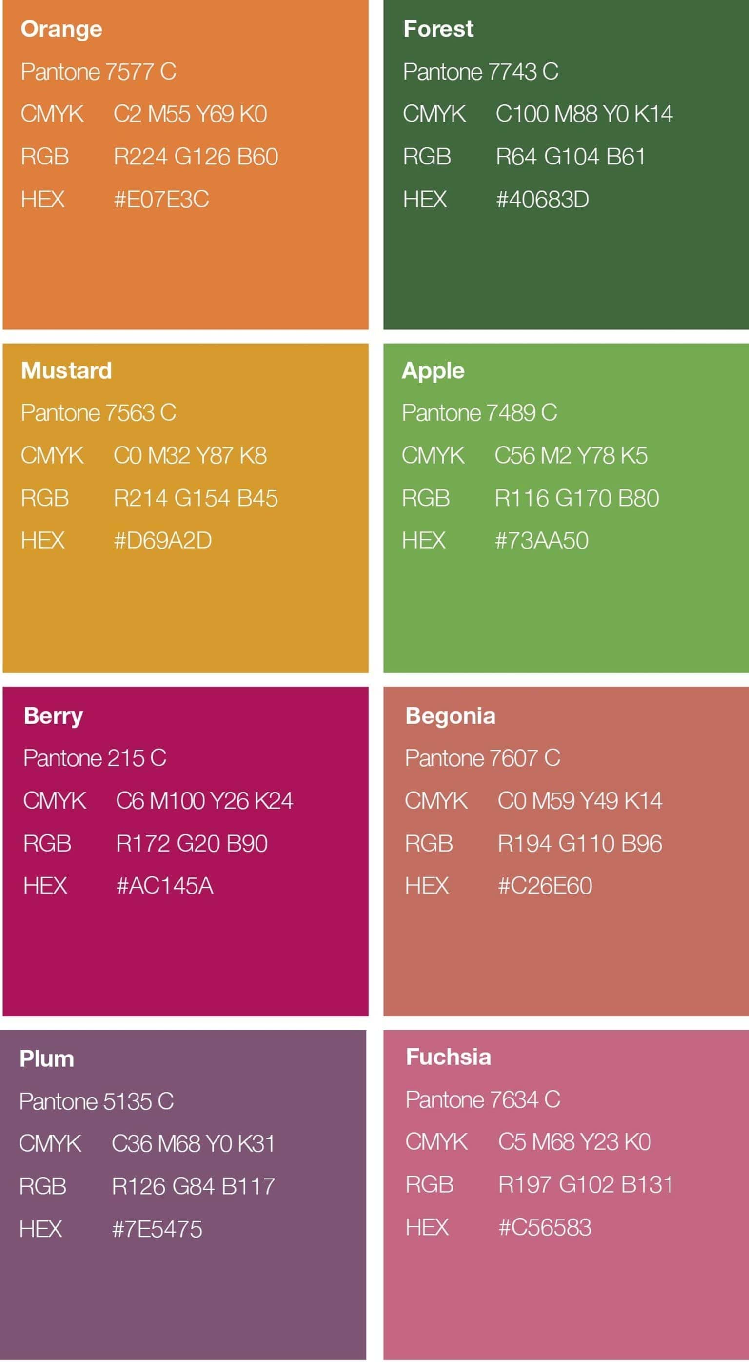
A secondary palette has been created to complement the primary palette. It can be used to extend the primary brand colours for both online and print.
Secondary colours can be used to highlight information, or create added visual excitement. These colours should be used sparingly and only one or two additional colours should be added at a time.
Photography
When choosing photography, please make every effort to consider the following tips:
- a clear subject, sharp and in focus
- as high resolution as possible
- imagery should be friendly, inviting and employ natural light
- display a feeling of real life and real learning moments
- it should not be too posed. Try to reflect the diversity in your organisation and the learners you serve as this will help to keep your imagery feeling honest and real life.
The images below can be used as a reference to give you an idea of what type of imagery will work well in the templates that follow.
Images of learning moments are ideal, but profile images of single learners can also be used to good effect.
Ensure you obtain formal permission from the people featured in the image, and make sure they are made aware of how the image will be used.
Brand icons
A set of icons has been created to help communicate the broad course offerings available through the Learn Local sector.
The style is clean and uncluttered for ease of application and recognition.
Icons can be used as primary line work, or as coloured ‘seed’ shaped box.
Icons can be used as a set to communicate the full Learn Local offering, or you can use individual icons by themselves to communicate a particular part of the Learn Local offering.
For example, if you are promoting a Learn Local English language course, you may like to add the English icon to the promotional flier/advert/social media tile etc.
Updated


