An increasing number of people interact with Brand Victoria sites across devices other than desktop, so it’s incredibly important to ensure these sites are optimised for a range of tablet and mobiles devices.
Earlier in the document, we defined a range of popular screen sizes, as well as indicating whether or not they are retina (which is important for scaling).
In this section we’ll mention a couple of common breakpoints, make a few suggestions for how pages should stack or respond across devices and outline some helpful guidelines for scaling fonts.
Breakpoints you should consider
In the case of breakpoints, we won’t be taking into account the retina display variable. So while your design for an iPhone 6 may be in a 750px wide Photoshop file, the actual breakpoint would be 375px as an iPhone 6 is a 2x retina display. The table below highlights a few key breakpoints you should consider using.
| Device | Breakpoint (px) |
|---|---|
| X small | 0 |
| Small | 576 |
| Medium | 768 |
| Large | 992 |
| X large | 1200 |
| XX large | 1600 |
| XXX large | 2560 |
The number of breakpoints you have will depend largely on your designs. It’s strongly recommended you have a minimum of 4 breakpoints. For example:
- desktop
- tablet landscape (for example, iPad Air)
- tablet portrait (for example, iPad Air) or large mobile (for example, iPhone 6 Plus)
- standard mobile (for example, iPhone 6)
In the following sections, we’ve recommended some standard breakpoints, but these are just a guide and can be tweaked if needed. Alternatively, if you’re working together with a developer, you may be able to adjust some of your designs on the fly at certain breakpoints, rather than designing entire photoshop files for a range of pages at additional breakpoints.
Designing for desktop
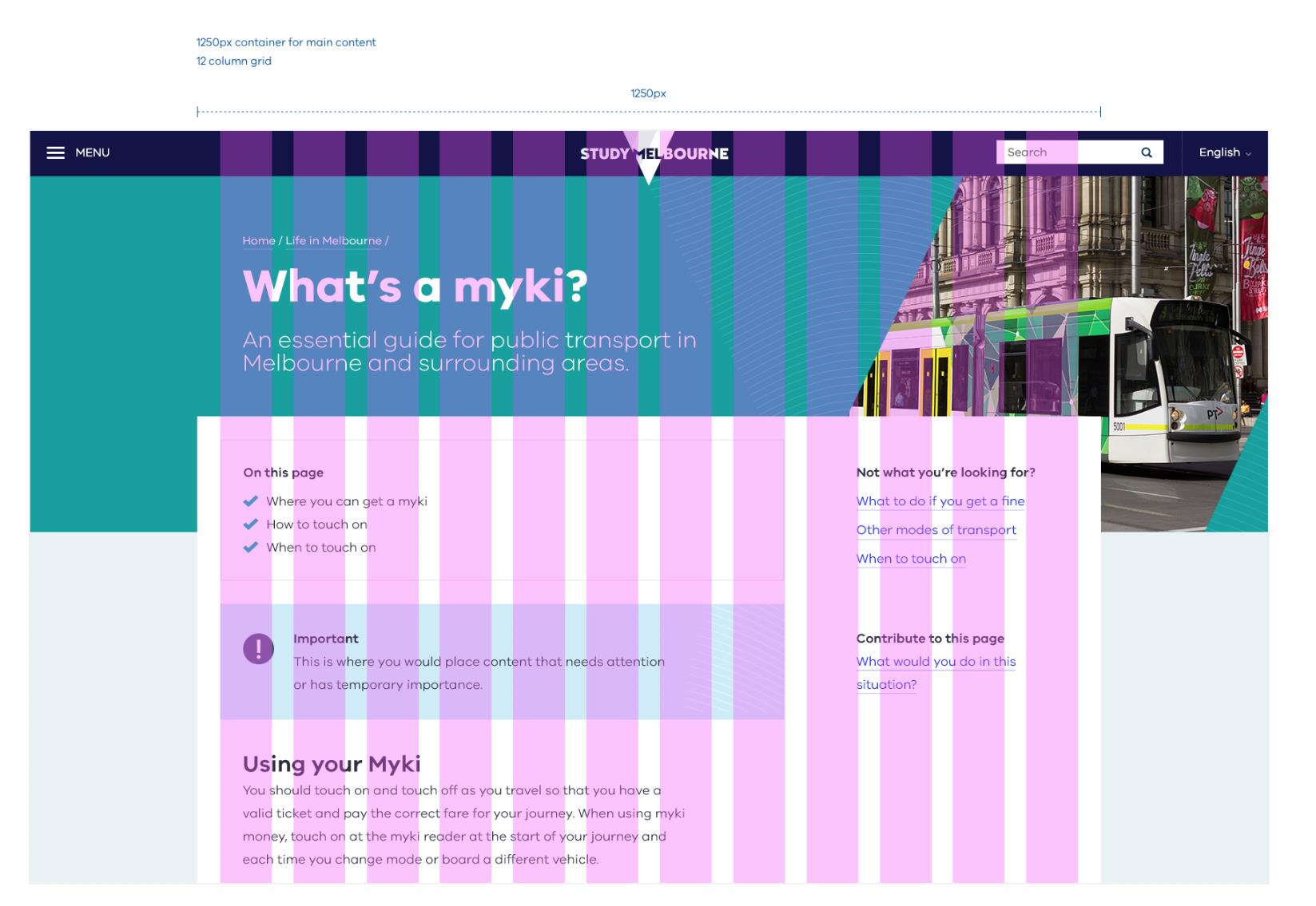
Since desktop is the largest possible view the user will ever see your content, this is a good time to determine the container in which your content lives. Is the page at all fixed width, and if so, at what point?
We’re not going to define this, as it’s largely dependent on the design. But if you’re stuck, something around 1200px to 1400px is a good starting point for a standard content page. Depending on the display (for example, Thunderbolt vs Macbook Air), this could be quite narrow, which means you’ll likely have a background that expands as the user extends their web browser.
Keep in mind: If you’re designing for desktop based on a large monitor like a Thunderbolt screen, you may also want to design a smaller desktop version which would be suitable to view on a 13-inch Macbook.
If you’re following a basic 12-column grid, there are a few structural suggestions you could follow. Using a standard content page as an example (which could include a variety of modules), we’ve made a few suggestions below.
If a sidebar is crucial to your design:
- eight of the 12 columns could be used for content (for example, body copy, images, videos, and so on)
- three to four columns might be used for a sidebar (if your design requires this)
- one column could also be used to add space between the main content section and the sidebar. Spacing is important here, as it will help differentiate between your content sections (for example, main content and sidebar)
If your page is split 50/50:
When choosing how to allocate content across columns, keep in mind ideal line lengths to inform your decision. A 50/50 split is probably the lowest you’d want to go. If text starts to take up less than 50% of the page, it’s likely the line length will be too short and pages of body copy will start to become very long.
There are many different layout options you could implement in your designs. The most important takeaway is to ensure your columns support these layouts and make it easier for the user to access the information they need.
Designing for tablet
We've recommended 2 standard breakpoints – 1024px for an iPad viewed at tablet orientation and 768px for an iPad viewed portrait orientation. Depending on your design, you may like to define additional breakpoints. If you’re stuck, you can refer to the breakpoints table shown earlier.
A standard eight-column grid can be used on for both orientations. An example of each is below.
Tablet landscape
The suggested breakpoint for tablet landscape is 1024px, but this can be amended to suit your design.
In terms of layout, this design will likely take on similar properties to your desktop design, as opposed to mobile (see below example). Using a standard content page as an example, we’ve made a few suggestions for how you might rollout a desktop design to iPad landscape.
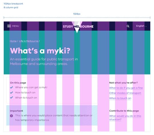
The background space on desktop generally disappears. Sidebars can still be included. Perhaps you have 5 columns for content and 2 or 3 for the sidebar. Alternatively, your sidebar might be positioned above or below page content depending on what the purpose of the sidebar is. For example, related links could move to the bottom of the page, as they provide next steps for the user. On the other hand, filters could move towards the top of the page, as they affect the structure of the content below.
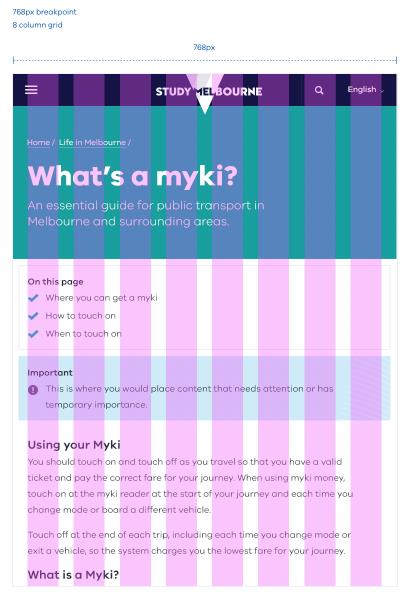
Tablet portrait
The recommended breakpoint for tablet portrait is 768px, but it can be changed to better suit your design.
This design will take on similar properties to your mobile design, as opposed to desktop. Generally, stacking left to right works really well here, unless there’s a sidebar. If there is a sidebar, you’ll have to consider the hierarchy of this content. Stacking left to right is not necessarily the answer, as sidebar content may become mixed in with major content, disrupting the flow and making it confusing for the user. Adjust your stacking to follow general page hierarchy rules.
Since tablet portrait is heading into mobile design territory; think about how you could display content on pages that are heavy with copy. For example, accordions.
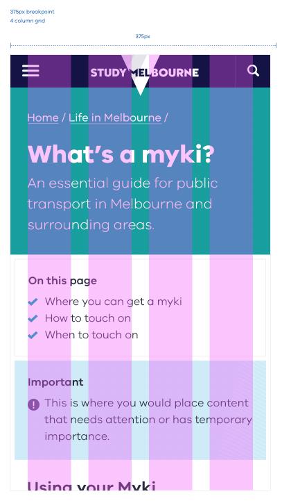
Designing for mobile
A breakpoint of 375px is suggested for mobile, as well as a standard 4-column grid. As mentioned earlier in the typography section, we make sure fonts are twice the scale of desktop. This is also something to keep in mind in other areas of design.
In terms of layout, the general rule is that content will stack left to right. But sometimes, this may not be the case. It’s important to consider page hierarchy when stacking content for mobile. Following a strict left to right stacking rule is not recommended, as this could potentially mean a sidebar stuck between a sandwich of content. This is confusing for the user and should be avoided.
Modules that directly affect content on the page should also be stacked towards the top. For example, on an events page it makes more sense for filters to be stacked above actual events, as modifying these filters affects which events are displayed.
Another component that should seriously be considered when designing for mobile is a Back to Top link or button as users are navigating through the same amount of content as desktop, but on a much smaller screen.
Responsive typography
The typography styles developed earlier in this document have established a set of hierarchy rules for type. But since we’re designing responsible designs, it’s crucial to take into account that type scales differently across devices.
In order to keep our font sizes visually consistent across devices, we need to consider the scaling of type relative to desktop. This will give us a calculated size which we must implement when designing in software such as Photoshop.
Using the example of an 80px Title Heading, we’ve determined the calculated size across a range of popular devices. For example, in order for a Title on an iMac display to visually look the same size as a Title on an iPhone 6, we’d make our Title in our Thunderbolt designs 80px, while the Title in our iPhone 6 designs would be scaled up to 160px, which is 2x the original size.
| Device | Visual size | Scaling (relative to large desktop) | Calculated size |
|---|---|---|---|
| Large desktop (>1200px) iMac | 80px | 1x | 80px |
| Small desktop (<1199px) Macbook Air | 80px | 0.8x | 64px |
| iPad Air & Pro |
80px |
2x | 160px |
| iPhone 6+ | 80px | 2.5x |
200px |
| iPhone 6 | 80px | 2x | 160px |
Another important point to consider when working with scaling type is the line-height and spacing. Just like the font size, these should be adjusted relative to the scaling listed in the table above. For example, if the line height of a Title Heading on a iMac display is 86px, then the calculated line height for an iPhone 6+ would be double, just as the H1 is double, making it 172px.
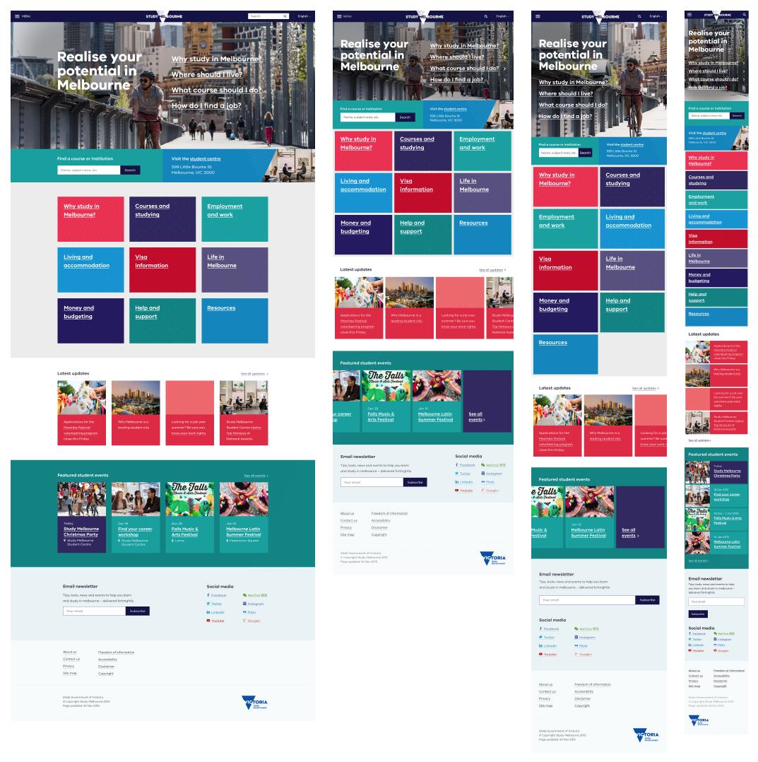
Responsive design examples
Above: An example of how a homepage may respond from desktop, to tablet landscape, to tablet portrait and finally, mobile.
Updated